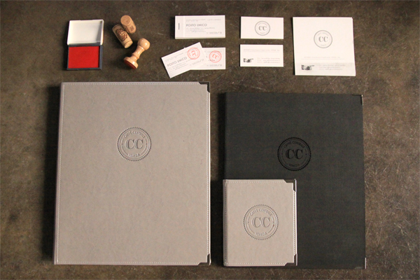
Take a look at this branding project for Caffè Centrale in Venice by Italian design studio Dry Design. The building that is now this cafe used to be a cinema, which inspired the perforated business card idea, but I must say I think it's a shame they didn't use this theme a bit more. Having said that I like the sleek, chic feel to it and of course I love the red stamp.
"All the communication wants to emphasise the relationship between past and future, between tradition and innovation. In fact, this restaurant offers contemporary cuisine, almost experimental, but inspired by venetian tradition."You can see more of their work over here.


No comments:
Post a Comment