Getting typography right can be tricky. It's pretty easy to tell when something doesn't look good, but knowing exactly why it doesn't look good is a whole other ball game.
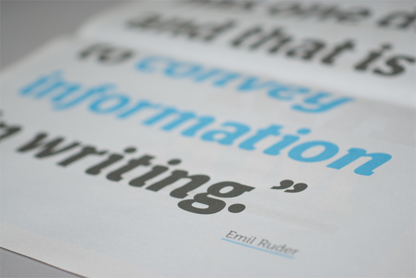
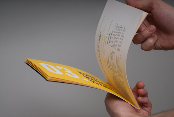
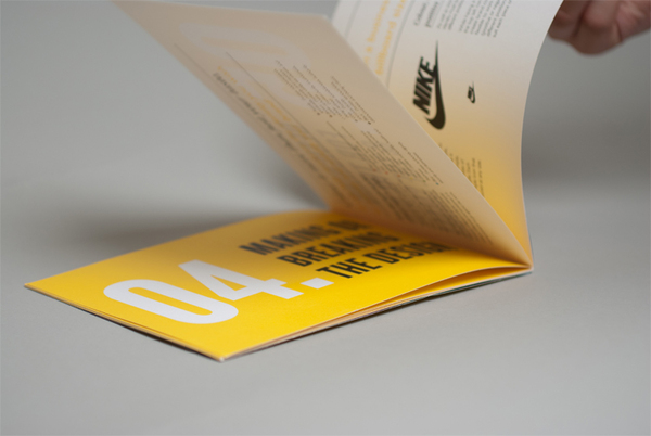
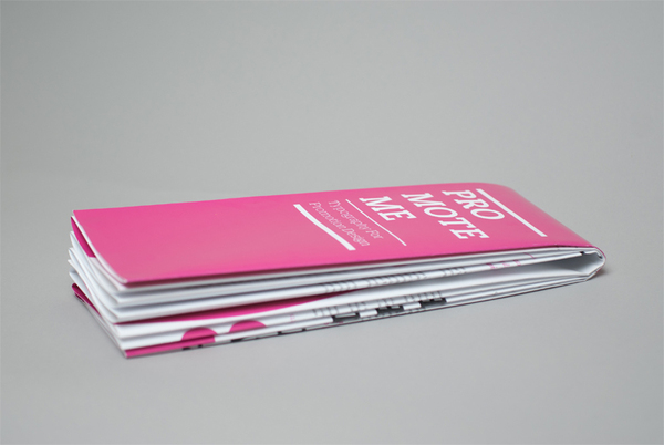
Introducing the Baseline, a typographical survival kit for students, created as a final exam piece by Brit designer Peter Dyer.
"I decided to explore the role and importance of typography in design and consider how a new design student could be better prepared to utilise it. The project had to simplify a great deal of information and provide a fresh solution for creative students, I wanted it to both inform and inspire."You can see more of Peter's work here.


I love your prints. They have outstanding quality. These prints can really attract customers.
ReplyDeletewww.specialforces.com